Trait data
Last updated on 2023-07-11 | Edit this page
Overview
Questions
- What information is captured via trait data?
- How do you read, clean, and visualize trait data?
- What do Hill numbers convey in the context of trait data?
Objectives
After following this episode, participants should be able to…
- Import trait data in a CSV format into the R environment
- Clean taxonomic names using the
taxizepackage - Aggregate traits
- Visualize trait distributions
- Calculate Hill numbers
- Interpret Hill numbers using ranked trait plots
Introduction to traits
Trait data is both old and new in ecology.
Similarly to abundance, investigating trait data can give insights into the ecological processes shaping different communities. Specifically, it would be interesting to answer questions like: 1) how much does a specific trait vary in a community?; 2) Are all species converging into a similar trait value or dispersing into a wide range of values for the trait?; 3) do those patterns of variation change across different communities? Answering these questions can help us understand how species are interacting with the environment and/or with each other.
Defining what exactly constitutes a trait, and measuring traits, can get complicated in ecology. (For example, there are lots of things we can measure about even just a leaf - but it’s another story to understand which of those attributes are telling us something ecologically meaningful). Ideally, we’d want to focus on a trait that is easily measurable and also linked to ecological features of interest. One such trait is body size. Body size is correlated with a whole host of ecologically meaningful traits, and is one of the easiest things to measure about an organism.
Similarly to how we look at community-wide distributions of abundance, we can generate and interpret community-wide trait distributions.
And, similar to how we can look at species abundance diversity using Hill numbers, we can look at trait diversity using a trait Hill number.
Working with trait data
Importing and cleaning trait data
Here, we will work with a dataset containing values of body mass for the species in the Hawaiian islands. Unlike the abundance data, each row represents one specimen: in this dataset, each row contains the body mass measured for that specimen. Our overall goal here is to clean this data and attach it to the species data, so we can investigate trait patterns per community.
We’re starting with a challenge! First, let’s load the packages we’ll need for the whole episode (you won’t need all of them for this first challenge)
R
library(taxize)
library(dplyr)
OUTPUT
Attaching package: 'dplyr'OUTPUT
The following objects are masked from 'package:stats':

    filter, lag
OUTPUT
The following objects are masked from 'package:base':

    intersect, setdiff, setequal, union
R
library(tidyr)
library(hillR)
Challenge
In the abundance-data episode, you learned how to read in a
CSV file with the read.csv() function. In
addition, you learned how to clean and standardize the taxonomic
information in your data set using the gnr_resolve()
function from the taxize package.
You’re going to use those skills to import and clean the trait data
set. The trait data set contains two columns: GenSp, which
contains the binomial species names, and mass_g, which
contains the individual’s mass in grams, the metric of body size chosen
for the study. The data also contain typos and a problem with the
taxonomy that you must correct and investigate. Make sure to glance at
the data before cleaning!
Your trait data is located at: https://raw.githubusercontent.com/role-model/multidim-biodiv-data/main/episodes/data/body_size_data.csv
Read in the traits data using the read.csv function and
supplying it with the path to the data.
R
traits <- read.csv('https://raw.githubusercontent.com/role-model/multidim-biodiv-data/main/episodes/data/body_size_data.csv')

head(traits)
OUTPUT
         GenSp   mass_g
1 Cis signatus 2.499395
2 Cis signatus 2.544560
3 Cis signatus 3.045801
4 Cis signatus 2.471702
5 Cis signatus 3.427594
6 Cis signatus 2.520676
Check the names of the traits using the gnr_resolve()
function. To streamline your efforts, supply only the unique species
names in your data to gnr_resolve().
R
# only need to check the unique names
species_list <- unique(traits$GenSp)

name_resolve <- gnr_resolve(species_list, best_match_only = TRUE,
                            canonical = TRUE)

head(name_resolve)
OUTPUT
# A tibble: 6 × 5
  user_supplied_name   submitted_name      data_source_title score matched_name2
  <chr>                <chr>               <chr>             <dbl> <chr>
1 Cis signatus         Cis signatus        Encyclopedia of … 0.988 Cis signatus
2 Acanthia procellaris Acanthia procellar… uBio NameBank     0.988 Acanthia pro…
3 Spolas solitaria     Spolas solitaria    Encyclopedia of … 0.988 Spolas solit…
4 Spolas solitari      Spolas solitari     Catalogue of Lif… 0.75  Spolas solit…
5 Laupala pruna        Laupala pruna       National Center … 0.988 Laupala pruna
6 Toxeuma hawaiiensis  Toxeuma hawaiiensis Encyclopedia of … 0.988 Toxeuma hawa…
To quickly see which taxa are in conflict with taxize’s,
use bracket subsetting and Boolean matching.
R
mismatches_traits <-
    name_resolve[name_resolve$user_supplied_name != name_resolve$matched_name2,
                 c("user_supplied_name", "matched_name2")]

mismatches_traits
OUTPUT
# A tibble: 10 × 2
   user_supplied_name      matched_name2
   <chr>                   <chr>
 1 Spolas solitari         Spolas solitaria
 2 Metrothorax deverilli   Metrothorax
 3 Drosophila obscuricorni Drosophila obscuricornis
 4 Cis bimaculatu          Cis bimaculatus
 5 Agrotis chersotoides    Agrotis
 6 Eurynogaster vittat     Eurynogaster vittata
 7 Atelothrus depressu     Atelothrus depressus
 8 Hylaeus sphecodoide     Hylaeus sphecodoides
 9 Hyposmocoma sagittat    Hyposmocoma sagittata
10 Campsicnemus nigricolli Campsicnemus nigricollis
Fixing the names comes in two steps. First, we join the
traits dataframe with the name_resolve
dataframe using the left_join() function. Note, we indicate
that the GenSp and user_supplied_name columns
have the same information by supplying a named vector to the
by = argument.
R
traits <- left_join(traits,
                    name_resolve[, c("user_supplied_name", "matched_name2")],
                    by = c("GenSp" = "user_supplied_name"))

head(traits)
OUTPUT
         GenSp   mass_g matched_name2
1 Cis signatus 2.499395  Cis signatus
2 Cis signatus 2.544560  Cis signatus
3 Cis signatus 3.045801  Cis signatus
4 Cis signatus 2.471702  Cis signatus
5 Cis signatus 3.427594  Cis signatus
6 Cis signatus 2.520676  Cis signatus
Then, to fix Agrotis chersotoides and Metrothorax deverilli, as in abundance-data episode, use bracketed indexing, boolean matching, and assignment.
In addition, although not necessary, changing the column name
matched_name2 to final_name to give it a more
sensible name for later use is good practice.
R
traits$matched_name2[traits$matched_name2 == "Agrotis"] <-
    "Peridroma chersotoides"

traits$matched_name2[traits$matched_name2 == "Metrothorax"] <-
    "Metrothorax deverilli"

colnames(traits)[colnames(traits) == "matched_name2"] <- "final_name"

head(traits)
OUTPUT
         GenSp   mass_g   final_name
1 Cis signatus 2.499395 Cis signatus
2 Cis signatus 2.544560 Cis signatus
3 Cis signatus 3.045801 Cis signatus
4 Cis signatus 2.471702 Cis signatus
5 Cis signatus 3.427594 Cis signatus
6 Cis signatus 2.520676 Cis signatus
Summarizing and cleaning trait data
When analyzing trait data, it often needs to be summarized at a higher level than the individual. For instance, many community assembly analyses require species-level summaries, rather than individual measurements. So, we often want to calculate summary statistics of traits for each species. For numeric measurements, body size, statistics like the mean, median, and standard deviation give information about the center and spread of the distribution of traits for the species. For this section, you will aggregate the trait data to the species level, calculating the mean, median, and mode of body size for each species.
While there are methods to aggregate data in base R, the dplyr makes this task and other
data wrangling tasks much more intuitive. The function
group_by() groups your data frame by a variable. The first
argument to group_by() is your data frame, and all
following unnamed arguments are the variables you want to group the data
by. In our case, we want to group by species name, so we’ll supply
final_name.
R
library(dplyr)

# group the data frame by species
traits_sumstats <- group_by(traits, final_name)
group_by() just adds an index that tells any following
dplyr functions to perform their calculations on the group
the data frame was indexed by. So, to perform the actual calculations,
we will use the summarize() function
(summarise() works too for non-Americans). The first
argument you supply is the data frame, following by the calculations you
want to perform on the grouped data and what you want to name the
resulting variables. The structure is
new_var_name = function(original_var_name) for each
calculation. Here, we’re using the mean(),
median(), and sd() functions. Then, we’ll take
a look at the new data set with the head() function.
R
# summarize the grouped data frame, so you're calculating the summary statistics for each species
traits_sumstats <-
    summarize(
        traits_sumstats,
        mean_mass_g = mean(mass_g),
        median_mass_g = median(mass_g),
        sd_mass_g = sd(mass_g)
    )

head(traits_sumstats)
OUTPUT
# A tibble: 6 × 4
  final_name               mean_mass_g median_mass_g sd_mass_g
  <chr>                          <dbl>         <dbl>     <dbl>
1 Acanthia procellaris           1.09          1.13     0.241
2 Agonismus argentiferus         5.31          5.55     0.992
3 Atelothrus depressus           0.529         0.521    0.127
4 Campsicnemus nigricollis       0.422         0.375    0.0992
5 Chrysotus parthenus            1.77          1.70     0.273
6 Cis bimaculatus                2.31          2.27     0.605
Finally, you need to add the aggregated species-level information back to the abundance data, so you have the summary statistics for each species at each site.
First, re-read in the abundance data you used in the abundance episode.
R
abundances <- read.csv("https://raw.githubusercontent.com/role-model/multidim-biodiv-data/main/episodes/data/abundances_resolved.csv")

head(abundances)
OUTPUT
     island  site                GenSp abundance       submitted_name
1 BigIsland BI_01         Cis signatus       541         Cis signatus
2 BigIsland BI_01 Acanthia procellaris        64 Acanthia procellaris
3 BigIsland BI_01     Spoles solitaria        34     Spoles solitaria
4 BigIsland BI_01        Laupala pruna        21        Laupala pruna
5 BigIsland BI_01  Toxeuma hawaiiensis       111  Toxeuma hawaiiensis
6 BigIsland BI_01  Chrysotus parthenus       208  Chrysotus parthenus
                              data_source_title score        matched_name2
1                          Encyclopedia of Life 0.988         Cis signatus
2                                 uBio NameBank 0.988 Acanthia procellaris
3                   Catalogue of Life Checklist 0.750     Spolas solitaria
4 National Center for Biotechnology Information 0.988        Laupala pruna
5                          Encyclopedia of Life 0.988  Toxeuma hawaiiensis
6                          Encyclopedia of Life 0.988  Chrysotus parthenus
            final_name
1         Cis signatus
2 Acanthia procellaris
3     Spolas solitaria
4        Laupala pruna
5  Toxeuma hawaiiensis
6  Chrysotus parthenus
To join the data, you’ll use left_join(), which is
hopefully getting familiar to you now!
abundances should be on the left side, since we want the
species-information for each species in each community.
R
traits_sumstats <- left_join(abundances,
                             traits_sumstats,
                             by = "final_name")

head(traits_sumstats)
OUTPUT
     island  site                GenSp abundance       submitted_name
1 BigIsland BI_01         Cis signatus       541         Cis signatus
2 BigIsland BI_01 Acanthia procellaris        64 Acanthia procellaris
3 BigIsland BI_01     Spoles solitaria        34     Spoles solitaria
4 BigIsland BI_01        Laupala pruna        21        Laupala pruna
5 BigIsland BI_01  Toxeuma hawaiiensis       111  Toxeuma hawaiiensis
6 BigIsland BI_01  Chrysotus parthenus       208  Chrysotus parthenus
                              data_source_title score        matched_name2
1                          Encyclopedia of Life 0.988         Cis signatus
2                                 uBio NameBank 0.988 Acanthia procellaris
3                   Catalogue of Life Checklist 0.750     Spolas solitaria
4 National Center for Biotechnology Information 0.988        Laupala pruna
5                          Encyclopedia of Life 0.988  Toxeuma hawaiiensis
6                          Encyclopedia of Life 0.988  Chrysotus parthenus
            final_name mean_mass_g median_mass_g   sd_mass_g
1         Cis signatus  2.75162128    2.53261792 0.395389440
2 Acanthia procellaris  1.09171586    1.13005561 0.241013781
3     Spolas solitaria  3.01819088    3.19822329 0.612003059
4        Laupala pruna  0.05259815    0.05058839 0.009513021
5  Toxeuma hawaiiensis  2.16818518    2.20868688 0.301463517
6  Chrysotus parthenus  1.76717404    1.69687138 0.273022541
Visualizing trait distributions
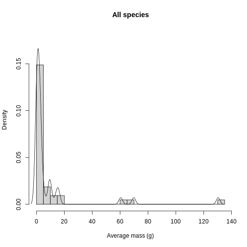
Histograms and density plots can help give you a quick look at the distribution of your data. For quality control purposes, they are useful to see if there are any suspicious values due to human error. Let’s overlay the histogram and density plots to get an idea of what aggregated (histogram) and smoothed (density) representations of the data look like.
The first argument to the hist() function is your data.
breaks sets the number of histogram bars, which can be
tuned heuristically to find a number of bars that best represents the
distribution of your data. I found that breaks = 40 is a
reasonable value. xlab, ylab, and
main are all used to specify labels for the x-axis, y-axis,
and title, respectively. When scaling the plot, sometimes base R
plotting functions aren’t as responsive to the data as we like. To fix
this, you can use the xlim or ylim functions
to set the value range of the x-axis and y-axis, respectively. Here, we
set ylim to a vector c(0, 0.11), which
specifies the y-axis to range from 0 to 0.11.
If you’re used to seeing histograms, the y-axis may look unfamiliar.
To get the two plots to use the same scale, you set
freq = FALSE, which converts the histogram counts to a
density value. The density scales the distribution from 0-1, so the bar
height (and line height on the density plot) is a fraction of the total
distribution.
Finally, to add the density line to the plot, you calculate the
density of the trait distribution with the density()
function and wrap it with the lines() function.
R
hist(
    traits_sumstats$mean_mass_g,
    breaks = 40,
    xlab = "Average mass (g)",
    ylab = "Density",
    main = "All species",
    ylim = c(0,0.18),
    freq = FALSE
)

lines(density(traits_sumstats$mean_mass_g))
In addition to quality control, knowing the distribution of trait data lends itself towards questions of what processes are shaping the communities under study. Are the traits overdispersed? Underdispersed? Does the average vary across communities? To get at these questions, you need to plot each site and compare among sites. To facilitate comparison, you’re going to layer the distributions on top of each other in a single plot. Histograms get cluttered quickly, so let’s use density plots for this task.
To plot each site, you need a separate dataframe for each site. The
easiest way to do this is with the split() function, which
takes a dataframe followed by a variable to split the dataframe by. It
then returns a list of data frames for each element in the variable.
Running head() on the list returns a lot of output, so
you can use the names() function to make sure the names of
the dataframes in your list are the sites you intended to split by.
R
# split by site
traits_sumstats_split <- split(traits_sumstats, traits_sumstats$site)

names(traits_sumstats_split)
OUTPUT
[1] "BI_01" "KA_01" "MA_01"To plot the data, you first need to initialize the plot with the
plot() function of a single site’s density. Here is also
where you add the plot aesthetics (labels, colors, line characteristics,
etc.). You’re labeling the title and axis labels with main,
xlab, and ylab. The lwd
(“linewidth”) function specifies the size of the line, and I found a
value of two is reasonable. You then supply the color of the line
(col) with a color name or hex code. I chose a hex
representing a purple color from the viridis
color palette. Finally, you need to specify the x-axis limits and y-axis
limits with xlim and ylim. While a negative
mass doesn’t make biological sense, it is an artifact of the smoothing
done by the density function.
To add density lines to the plot, you use the lines()
function with the data for the desired site as the first argument. You
also need to specify the line-specific aesthetics for each line, which
are the lwd and col. I chose the green and
yellow colors from the viridis palette, but you can pick
whatever your heart desires!
Finally, you need a legend for the plot. Within the
legend() function, you specify the position of the legend
(“topright”), the legend labels, the line width, and colors to assign to
the labels.
R
plot(
    density(traits_sumstats_split$KA_01$mean_mass_g),
    main = "Average mass per study site",
    xlab = "Average mass (g)",
    ylab = "Density",
    lwd = 2,
    col = "#440154FF",
    xlim = c(-3, 20),
    ylim = c(0, 0.25)
)

lines(
    density(traits_sumstats_split$MA_01$mean_mass_g),
    lwd = 2,
    col = "#21908CFF"
)

lines(
    density(traits_sumstats_split$BI_01$mean_mass_g),
    lwd = 2,
    col = "#FDE725FF"
)

legend(
    "topright",
    legend = c("Kauai", "Maui", "Big Island"),
    lwd = 2,
    col = c("#440154FF", "#21908CFF", "#FDE725FF")
)
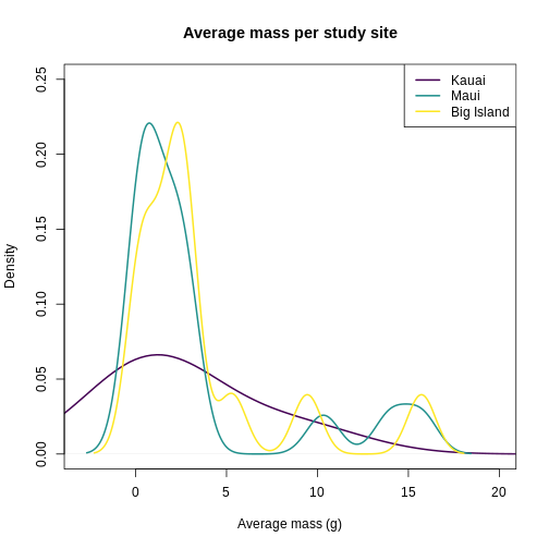
It looks like Kauai insects have a smoother distribution of body masses, while Maui and Big Island show more clumped distributions, possibly due to higher immigration on those islands.
Hill numbers
Hill numbers are a useful and informative summary of trait diversity,
in addition to other biodiversity variables (Gaggiotti
et al. 2018). They contain signatures of the processes underlying
community assembly. To calculate Hill numbers for traits, you’re going
to use the hill_func() function from the hillR
package. It requires two inputs- the site by species abundance dataframe
and a traits dataframe that has species as rows and traits as
columns.
R
abundances_wide <- pivot_wider(
    abundances,
    id_cols = site,
    names_from = final_name,
    values_from = abundance,
    values_fill = 0
)

# tibbles don't like row names
abundances_wide <- as.data.frame(abundances_wide)

row.names(abundances_wide) <- abundances_wide$site

# remove the site column
abundances_wide <- abundances_wide[,-1]
Now, to create the traits dataframe for Hill number calculations purposed, we just need the taxonomic names and trait mean.
R
traits_simple <- traits_sumstats[, c("final_name", "mean_mass_g")]

head(traits_simple)
OUTPUT
            final_name mean_mass_g
1         Cis signatus  2.75162128
2 Acanthia procellaris  1.09171586
3     Spolas solitaria  3.01819088
4        Laupala pruna  0.05259815
5  Toxeuma hawaiiensis  2.16818518
6  Chrysotus parthenus  1.76717404
Next, you need to filter for unique species in the dataframe.
R
traits_simple <- unique(traits_simple)

head(traits_simple)
OUTPUT
            final_name mean_mass_g
1         Cis signatus  2.75162128
2 Acanthia procellaris  1.09171586
3     Spolas solitaria  3.01819088
4        Laupala pruna  0.05259815
5  Toxeuma hawaiiensis  2.16818518
6  Chrysotus parthenus  1.76717404
Finally, you need to set the species names to be row names and remove
the final_name column. Note, you have to use the
drop = FALSE argument because R has the funny behavior that
it likes to convert single-column dataframes into a vector.
R
row.names(traits_simple) <- traits_simple$final_name

traits_simple <- traits_simple[, -1, drop = FALSE]

head(traits_simple)
OUTPUT
                     mean_mass_g
Cis signatus          2.75162128
Acanthia procellaris  1.09171586
Spolas solitaria      3.01819088
Laupala pruna         0.05259815
Toxeuma hawaiiensis   2.16818518
Chrysotus parthenus   1.76717404
Next, you’ll use the hill_func() function from the
hillR package to calculate Hill numbers 0-2 of body size
across sites.
R
traits_hill_0 <- hill_func(comm = abundances_wide, traits = traits_simple, q = 0)

traits_hill_1 <- hill_func(comm = abundances_wide, traits = traits_simple, q = 1)

traits_hill_2 <- hill_func(comm = abundances_wide, traits = traits_simple, q = 2)
The output of hill_func() returns quite a few Hill
number options, which are defined in Chao
et al. 2014. For simplicity’s sake, we will look at
D_q, which from the documentation is the:
> functional Hill number, the effective number of equally abundant and functionally equally distinct species
R
traits_hill_1
OUTPUT
          BI_01      MA_01      KA_01
Q     0.7949925   5.049335   14.11121
FDis  0.5983183   4.283883   10.90624
D_q   7.7865058  13.561339   10.07768
MD_q  6.1902140  68.475746  142.20828
FD_q 48.2001378 928.622813 1433.12950
To gain an intuition for what this means, let’s plot our data. First, you will wrangle the output into a single dataframe to work with. Since Hill q = 0 is species richness, let’s focus on Hill q = 1 and Hill q = 2.
R
traits_hill <- data.frame(hill_trait_0 = traits_hill_0[3, ],
                          hill_trait_1 = traits_hill_1[3, ],
                          hill_trait_2 = traits_hill_2[3, ])

# I don't like rownames for plotting, so making the rownames a column
traits_hill <- cbind(site = rownames(traits_hill), traits_hill)

rownames(traits_hill) <- NULL

traits_hill
OUTPUT
   site hill_trait_0 hill_trait_1 hill_trait_2
1 BI_01     29.03417     7.786506     4.722840
2 MA_01     15.78844    13.561339    12.185382
3 KA_01     20.04110    10.077680     7.094183
Let’s look at how Hill q = 1 compare across sites.
R
plot(factor(traits_hill$site, levels = c("KA_01", "MA_01", "BI_01")),
     traits_hill$hill_trait_1, ylab = "Hill q = 1")
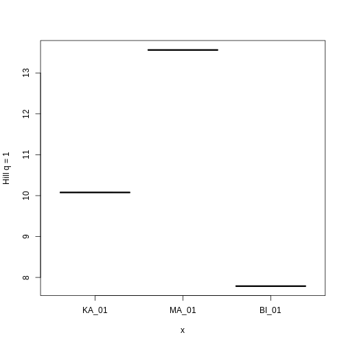
Hill q = 1 is smallest on the Big Island, largest on Maui, and in the middle on Kauai. But what does this mean? To gain an intuition for what a higher or lower trait Hill number means, you will make rank plots of the trait data, to make a plot analogous to the species abundance distribution.
R
# figure out max number of species at a site for axis limit setting below
max_sp <- sapply(traits_sumstats_split, nrow)
max_sp <- max(max_sp)


plot(
    sort(traits_sumstats_split$KA_01$mean_mass_g, decreasing = TRUE),
    main = "Average mass per study site",
    xlab = "Rank",
    ylab = "Average mass (mg)",
    pch = 19,
    col = "#440154FF",
    xlim = c(1, max_sp),
    ylim = c(0, max(traits_simple$mean_mass_g))
)

points(
    sort(traits_sumstats_split$MA_01$mean_mass_g, decreasing = TRUE),
    pch = 19,
    col = "#21908CFF"
)

points(
    sort(traits_sumstats_split$BI_01$mean_mass_g, decreasing = TRUE),
    pch = 19,
    col = "#FDE725FF"
)

legend(
    "topright",
    legend = c("Kauai", "Maui", "Big Island"),
    pch = 19,
    col = c("#440154FF", "#21908CFF", "#FDE725FF")
)
You can see clearly that the trait distributions differ across islands, where Maui has more species than the other islands and a seemingly more even distribution than Kauai. Kauai seems to have a greater spread of trait values, however, species abundance strongly influences the calculation of a Hill number. To visualize the role of abundance, we can replicate each species mean by the abundance of that species
R
# replicate abundances
biIndividualsTrt <- rep(traits_sumstats_split$BI_01$mean_mass_g,
                        traits_sumstats_split$BI_01$abundance)
maIndividualsTrt <- rep(traits_sumstats_split$MA_01$mean_mass_g,
                        traits_sumstats_split$MA_01$abundance)
kaIndividualsTrt <- rep(traits_sumstats_split$KA_01$mean_mass_g,
                        traits_sumstats_split$KA_01$abundance)


plot(
    sort(kaIndividualsTrt, decreasing = TRUE),
    main = "Average mass across individuals",
    xlab = "Rank",
    ylab = "Average mass (mg)",
    pch = 19,
    col = "#440154FF",
    ylim = c(0, max(traits_simple$mean_mass_g))
)

points(
    sort(maIndividualsTrt, decreasing = TRUE),
    pch = 19,
    col = "#21908CFF"
)

points(
    sort(biIndividualsTrt, decreasing = TRUE),
    pch = 19,
    col = "#FDE725FF"
)

legend(
    "topright",
    legend = c("Kauai", "Maui", "Big Island"),
    pch = 19,
    col = c("#440154FF", "#21908CFF", "#FDE725FF")
)
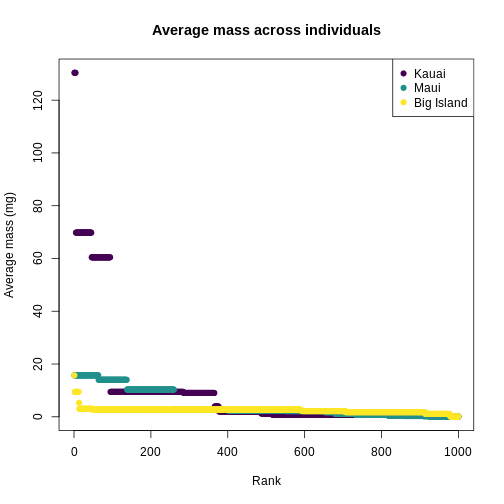
What we can see from the individuals-level plot is that much of the range of trait values on Kauai are brought by very rare species, these rare species do not contribute substantially to the diversity as expressed by Hill numbers.